
A Head Full of Wishes is a site for Galaxie 500, Luna, Damon & Naomi, Dean & Britta and Dean Wareham. With news, articles and lists of releases and past and future shows.
Substack
The Luna record sleeve art gallery (part one)

Luna over the years have curated quite an art gallery on the sleeves of their LPs in this post I’ll do a little run through. I don’t really know a great deal about the artists, or how or why any particular art or artist was chosen so this is mostly what I think I know, and what the Internet thinks it knows.
When I started this my intention was to cover all of Luna’s albums but since it has become quite lengthy I’ll stop at The Days of Our Nights and revisit Luna’s “Britta-era” albums later.
Lunapark (1992)

The sleeve of Lunapark has a picture of a pencil sharpener, I know that now, and it doesn’t look like anything else… now. A space age pencil sharpener for sure, but so obviously a pencil sharpener, and so obviously with a pencil sticking out of it. When I discovered what it was I felt a bit stupid for all the years it had been a spaceship or a ray gun. I posted it on Facebook a couple of years ago and it was quite a relief that a good few comments revealed that I wasn’t alone in my stupidity…

- “All these years I thought it was a toy ray gun”
- “I always thought it was a spaceship. Lol.”
- “SON OF A BITCH. It all makes sense now.”
- “Enlightened”
The pencil sharpener was designed by reknowned industrial designer Raymond Loewy whose designs ranged from a pencil sharpener to “the largest passenger locomotive ever constructed”.
Also to be found on the Lunapark sleeves are little bits of Kim Novak’s face who can be seen in full on the cover of the Smile EP.

The album credits Laurie Henzel with the art direction.
Meet the Product Designer Who Made Mid-Century America Look Clean and Stylish (Smithsonian Magazine, May 2019)
Bewitched (1994)
Bewitched actually has two quite distinct sleeves. The original that appeared on the CD and cassette releases in 1994 and then a radicaly different sleeve when the album was released on vinyl for the first time in 2012. The version released in 2012 was actually intended for the original release but was replaced at the last minute for the more abstract version. The back of the CD sleeve, and the booklet, included photos from the same session as the photo that finally arrived on the front of the LP versions.
To be honest I could never quite figure out exactly what was on the front of my CD.

The picture of the young woman sitting in a chair is a bit clearer to ID. The young woman is actress Chloë Sevigny and she’s sitting in a Ball Chair designed by Finnish designer Eero Aarnio in 1963 and watching (I think) a JVC videosphere telly.

Dean turned up in a Ball Chair in the video for his cover of Scott Walker’s Duchess (obviously this wasn’t a coincidence!).
https://www.youtube.com/watch?v=9E_4Jb__6bw
The photography was by Michael Levine and once again the art direction was by Laurie Henzel.
Penthouse (1995)
For Penthouse the band moved away from industrial design and the front cover of Penthouse is a beautiful photo taken from a series by photographer Ted Croner in 1947/8.
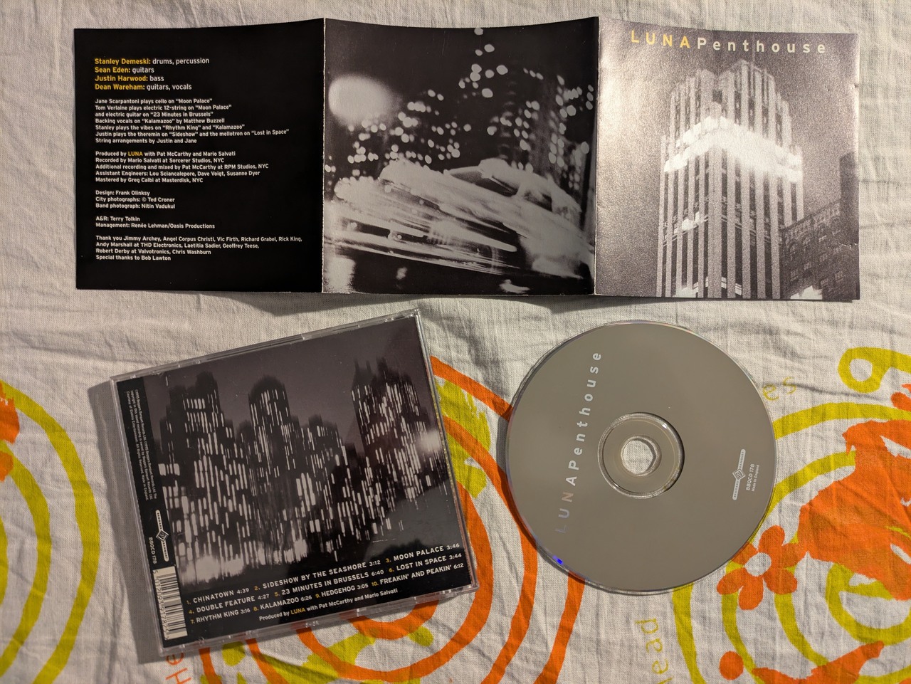
Dean Wareham explained how he came across the photos for the sleeve in an interview in Salon in 2016:
Frank Olinsky and I went to see a show of photographs by Ted Croner, who was part of the New York School of photographers from the 50s. He had taken some beautiful photographs of New York City buildings […] and we picked out these great photos of New York buildings at night—shimmering photos—the light seemed to pour out of them. I met Croner, and he explained that these signature shots of his were partially caused by the cold weather; that as he stood in Central Park taking those photos, it was so cold that his hands were shaking, which caused these blurred streaks of light.
The ultimate Luna interview (Salon, 2016)
Frank Olinsky also discussed the design of Penthouse in Rock That Font in 2011:
Dean had discovered Ted Croner’s magical photos of New York City and knew they were just right for the package. Three pictures were used: the cover photo of the lit-up skyscraper, a group of light-streaked high-rise buildings, and a blurry speeding taxi [...] Everything came together just right. That was the first time I used Interstate, but certainly not the last time I used this font!
Frank Olinsky - Rock That Font: Penthouse (2011)
The photo of the blurry speeding taxi that was used in the inside of the sleeve (and on the cover of the Hedgehog / 23 Minutes in Brussels single) was later used by Bob Dylan for the front of his 2006 LP Modern Times. This post on PopSpots does some fine research tracking down the locations of the photos.
In a post on Entertainment Weekly in 2006 the similarity was discussed:
Dylan declined to comment, but his album’s designer, Geoff Gans, told EW in an e-mail: ”I’m really surprised! I really liked Luna…but never saw that release. I’m fairly sure Bob never saw that release either…. Strange things happen every day.” Luna’s Dean Wareham, meanwhile, isn’t upset. ”I’d like to think that Dylan saw [our EP]. It would be flattering,” he says. ”But I doubt it.”
Bob Dylan's "Modern Times" looks a lot like Luna's "Hedgehog" (2006 from the Internet Archive)

Sleeve designed by Frank Olinsky, New Your City photos by Ted Croner and band photo by Nitin Vadakul.
Pup Tent (1997)
The photos used on Pup Tent and its associated singles were taken by photographer David Levinthal as part of his series Wild West, 1987-1989 and a number of different photos from the series were used.

The front cover is a cowboy entering a saloon and the inner sleeve has a cowboy (not the same one) riding and shooting - this one was also used for the Bobby Peru single. The Beautiful View single has the cowboy who entered the saloon, leaving it again, I guess after his business was concluded. I assume the cover of the IHOP single was also from this series but I’ve never managed to figure out what I was looking at.
Sleeve designed by Frank Olinsky, cowboy photos by David Levinthal, band photo by Jill Greenberg.
The Days of Our Nights (1999)
The painting on the front of The Days of Our Nights is called “Horizontal Blonde” and is by American artist Richard Phillips and dates from 1996. The album sleeve declares that the painting was from “the collection of Howard Rachofsky”. I suspect that is no longer the case.
The painting was sold by Christies in November 2004 for $119,500, I wonder if that was a loaded Luna fan?

Christies had some (questionable) insight into the painting in a “lot essay” on the auction page:
In Horizontal Blonde, one of the artist's most celebrated works, a lucious Marilyn Monroe-like woman is staring out at us, eyes half open, slack-jawed. She is lovely but suffering some, a stance that has come to symbolize the archetypal tortured beauty. Are we seeing her the morning after a rough night of partying? Along with Marilyn, she calls to mind the rock-and-roll women of the 1970s-Deborah Harry, Pat Benatar, Anne Wilson and Stevie Nicks. As the title indicates, she is laying down (implying sex), a night of partying (drugs) or dancing esctatically (rock-and-roll).
I say “questionable” because the next paragraph is this…
In a synergy of contemporary painting and music, Horizontal Blonde is featured on the cover of an album entitled "The Days of Our Nights" by Luna a British rock band that owes a debt to the now classic sounds 1970s American rock-and-roll, but tinged with the British Mod sound of the 1990s.
I wasn’t even aware that there was a “British Mod sound” in the 1990s… but then what do I know?

This is probably my least favourite Luna album cover, I think my natural prudishness finds it a little too much. In the Dean Wareham / Noah Baumbach interview with Salon from 2016 Dean drops something into the discussion that suggests that I may not be alone?
Noah: Sometimes, people are very wrong about their own stuff; they can’t see it clearly.
Dean: True. The members of New Order don’t like “Movement,” which is an album I love. Nico didn’t like “Chelsea Girls.” I love the cover image for “The Days of Our Nights”: the painting “Horizontal Blonde,” by Richard Phillips.
When Days was re-released on vinyl in 2023 Dean discussed the sleeve in a H.I. Art on the Edge listening party:
Well you know that painting was hanging at the Whitney during the biennial and it was Laurie Henzel who designed the art, she had been to see it but I think actually I had also bought the postcard when I saw it there, but anyway she knew Richard Phillips and suggested that as a as a cover. It's a pretty great painting.
I think that painting sold for a whole lot of money of which he didn't receive any you know how this because sometimes that artist makes this great painting early on and they sell it pretty cheap and then like five years later they're always a whole lot more. There's a movement among artists to try and do something about that to try and have some kind of tax so that when a dealer later sells your work for 30 million dollars maybe you get a cut too.
Horizontal Blonde also made it onto the front of the Luna 2000 calendar. Now, you know that you can re-use calendars every few years? Unfortunately because Luna’s only calendar was from the freak year that was a millennium change and a leap year it means that it is hardly ever re-usable! It’s first re-use year will be 2028, and the one after that 2056! I’ve been patiently waiting… I hope I don’t forget when it comes around!

I’ve put in a reminder…

Art direction by Laurie Henzel, cover image by Richard Phillips, band photographs by Michael Lavine